

Still need help?

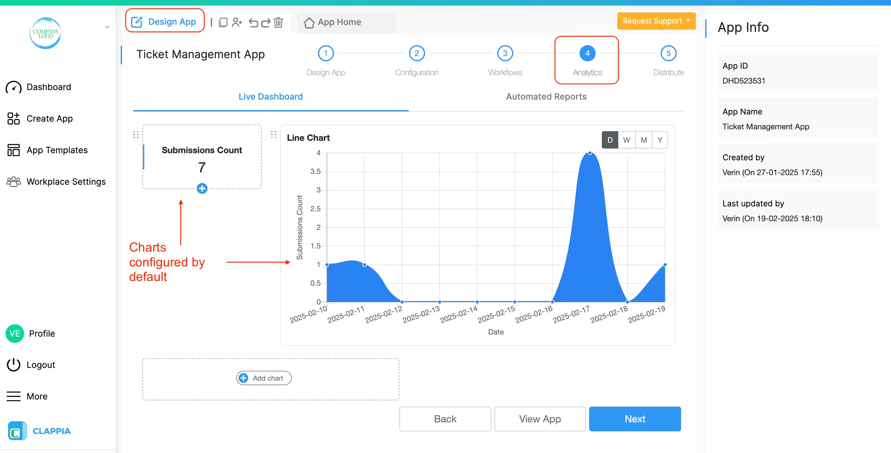
Open your app that needs charts to be configured. Go to Design App > Analytics > Live Dashboard tab. By default, there will already be some charts configured as examples. You can delete them if you wish. To add a new line chart, click on ‘Add chart’.
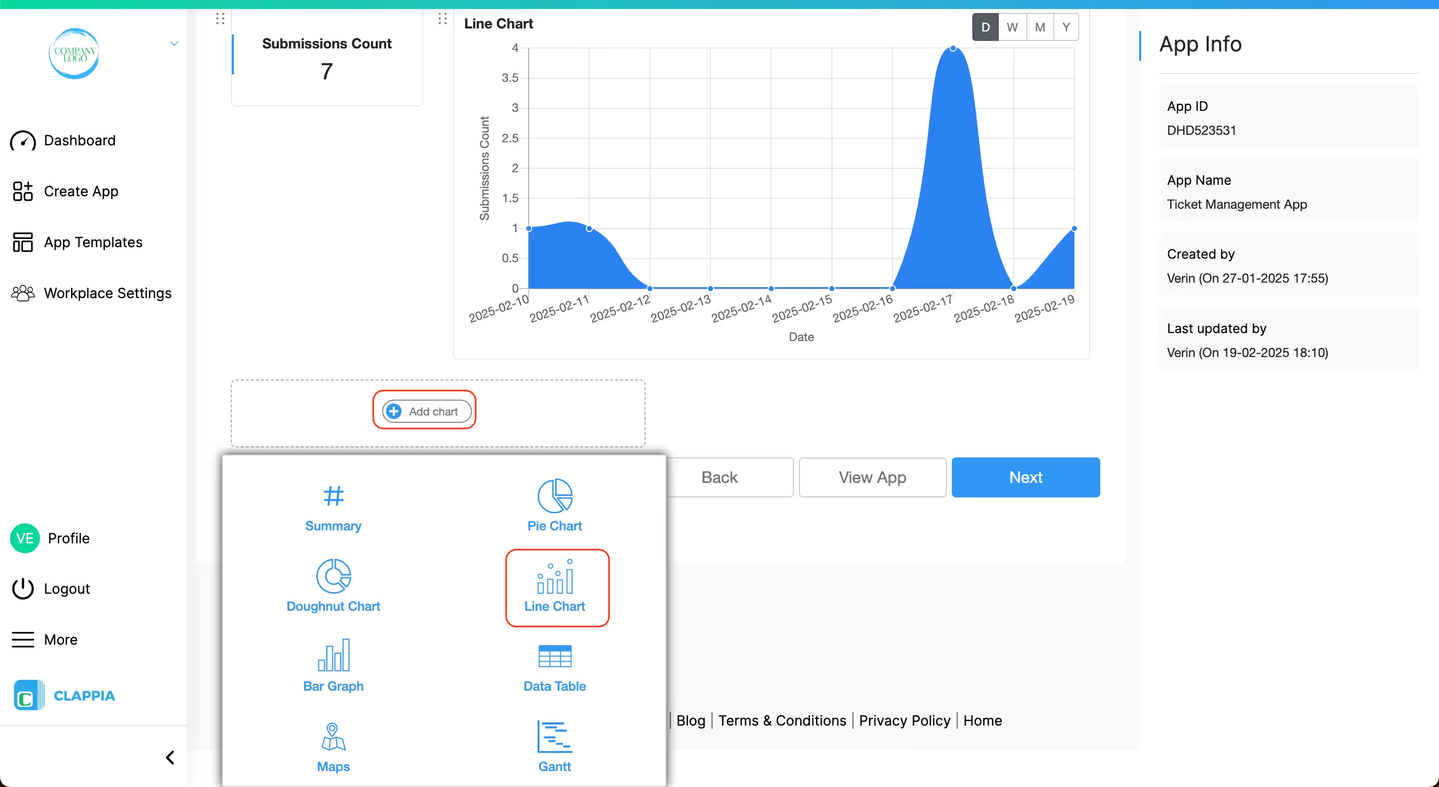
After selecting a line chart from the chart selection panel, you can configure the chart in right panel.
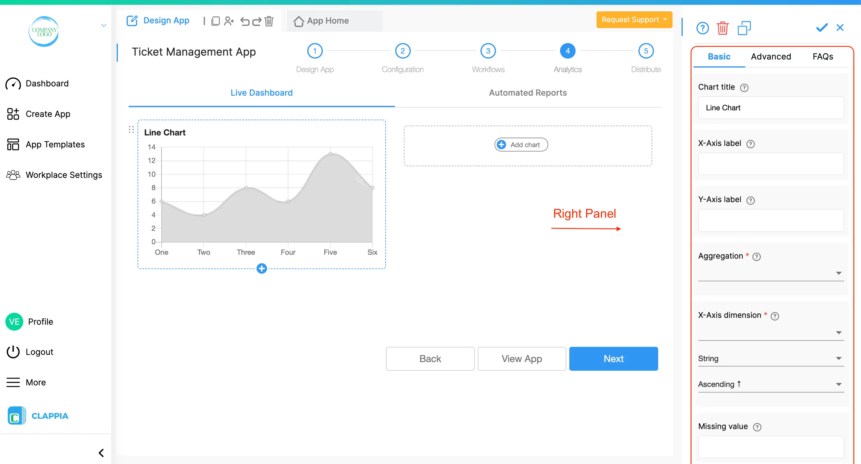
Following are the details of each field in the right panel:
Title of the chart. This can be empty.
Label for x-axis of chart. This can be empty.
Label for y-axis of chart. This can be empty.
Chart data values can be aggregation of some field/module values or simply a count of submissions. This field is required.
Supported aggregation functions are:
COUNT returns number of submissions. Other functions require an operand which can be one of the app fields. For more details, refer to the example at the end.
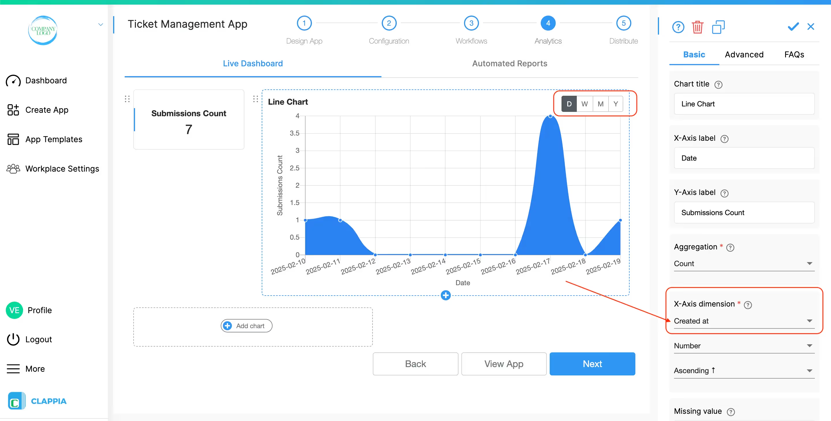
Data is grouped by the values of this field. This can be one of the app fields, status, submission creation time, submission modification time. This field is required. For more details, refer to the example at the end.
This chart type also segregates data periodically into daily, weekly, monthly, or yearly (DWMY) intervals. This functionality is available only when a date field is selected as the X-Axis dimension. You can use either a custom date field from your app or the default "Created At" variable, which captures the submission creation date.
Data can be further categorised by providing this dimension. This can be one of the app fields, status, submission creation time, submission modification time. This field is optional. For more details, refer to the example at the end.
The configuration for a line chart is the same as the configuration for a bar graph. Refer to example in bar graph.
L374, 1st Floor, 5th Main Rd, Sector 6, HSR Layout, Bengaluru, Karnataka 560102, India
3500 S DuPont Hwy, Dover,
Kent 19901, Delaware, USA


.svg)




3500 S DuPont Hwy, Dover,
Kent 19901, Delaware, USA
L374, 1st Floor, 5th Main Rd, Sector 6, HSR Layout, Bengaluru, Karnataka 560102, India