
Still need help?

This article explains the Camera, Images & Files block that can be added to design an app.

Click on the block and start editing on the panel that appears on the right side.
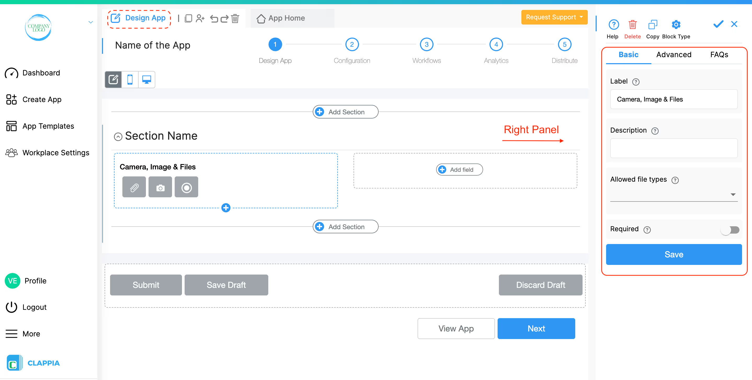
This is what appears as the label for the field that suggests the user upload a file or capture an image.
This is the text that goes below the attached file to help the user.
By default, all kinds of files are allowed to be uploaded. If you want a limited type of file, you should click on the file types that you want to allow.
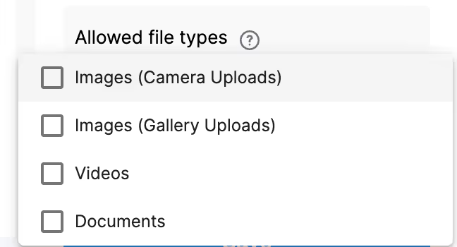
Tick this option if you want to force the end-users to capture images from their phone camera or web camera and not upload old photos from their galleries. For this option to work, please ensure that in the File Types option above, only Images (Camera Uploads) is selected.

If you configure ‘Allowed File Types’ to accept only Videos, then users will only be able to upload video files or record live videos.
Please note:
This distinction is important to keep in mind when designing apps that rely on video submissions.
You can control the maximum size of files uploaded to the Camera, Images & Files block at the workplace level.
To configure this, on the left panel of the workplace, go to Workplace Settings > Preferences > File Size Limits.
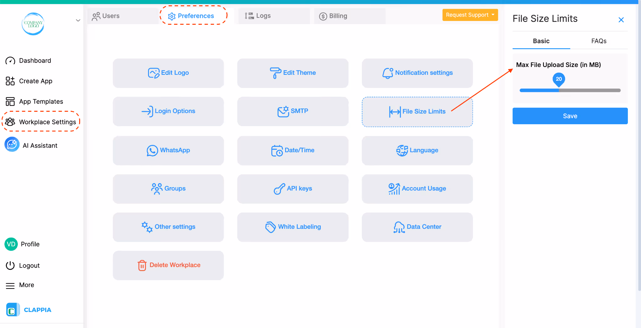
On the right panel, you can set Max File Upload Size (in MB) based on your workplace plan, with a maximum of 10 MB on the Starter plan and 50 MB on the Professional plan. This limit applies per file uploaded and is enforced across all Camera, Images & Files blocks as well as other attachment block types, in all apps within the workplace.
Before setting this value, consider whether the same limit is appropriate for every app in the workplace.
If multiple file uploads are allowed in a single field (up to 10), the configured file size limit applies individually to each file, not as a combined total.
For example, if the limit is set to 2 MB and the field allows 5 files, each file can be up to 2 MB in size.
Video Recording Limits (Mobile)
On the Clappia mobile app, users can record live videos directly using the Camera, Images & Files block but:
If a user attempts to upload or record a video that exceeds the configured file size limit, an error message is shown and the upload is blocked.
Note: In white-labelled apps, live video recording duration can be extended to 30 seconds
Enable this option if you want the end-user to compulsorily upload a file or capture an image.
Advanced Options
Use this option to show the advanced options to configure the camera block.


This is applicable only for the Clappia mobile app and not for the web app. When enabled, captured images will be automatically saved to the user’s device gallery. This applies only to images captured using the camera on the Clappia mobile app (Android and iOS) and does not apply to images uploaded from the gallery. If the ‘Allow to Edit Captured Image’ option is enabled, the edited image is saved to the gallery instead of the original image. The image will be saved even if it is later removed from the form.
When this option is enabled, users can annotate photos before uploading them. They can draw annotations, markers, or custom text directly on the captured image. This enhances the functionality by allowing users to highlight specific parts of the image or add contextual information before the photo is uploaded.
This applies only to images captured using the camera on the Clappia mobile app (Android and iOS) and does not apply to images uploaded from the gallery. On the web app, this option does not have any effect.
Enable this option for your users to limit the number of uploads at a single time. The maximum files a user can upload is 10.
Select the type of image quality you would like your end users to upload.
Low quality images have lower file sizes which might make it easier for users who have low connectivity to the internet to upload.
Notes on Image Size, Compression & Upload Performance
When users upload images or videos through the Camera, Images & Files block, Clappia automatically performs light optimization to reduce file size and storage usage. This optimisation is designed to maintain visual quality while improving storage efficiency and upload performance.
Similarly, videos may also undergo backend optimisation to ensure efficient storage and smoother handling within the platform. This process does not significantly reduce visible quality.
However, users should be aware that:
In low-connectivity environments:
These measures ensure that users do not lose captured media and can reattempt uploads when connectivity improves.
This option can be used to automatically put watermark text on all the image uploads. Useful for geolocation-tagging, timestamp-tagging of uploaded photos. Any other text like Customer Name, Site Name etc can also be put on the photos.
This will only work for Camera uploads and not for gallery uploads.
This field works exactly like any other field that supports formulae. Just type @ to see a list of all the fields defined in the app that can be put on the images.
You can use formulas inside Image Text to automatically place useful information on photos captured through the Camera block. This is helpful for field verification, audits, attendance logs, inspections, and anywhere you need proof of where and when a photo was taken.
When writing a formula, typing @ lets you select any field from your app. For example, if your form contains fields such as GPS Location, Date & Time, or Site Name, those values can be displayed directly on the captured image.
Example
Put Geolocation, date of visit and site name on the photos: Ensure that these fields are defined in the app.


Below are some more example setups and ready-to-use formula examples.
Example Field Setup
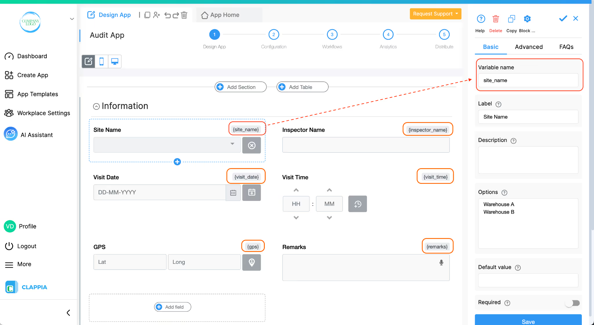
Your field names may differ, these are only examples to show how formulas work.
Formula Examples You Can Use
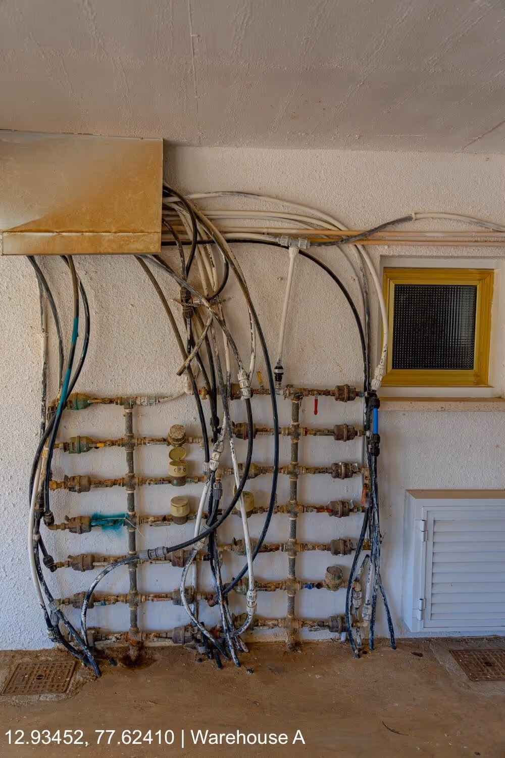
1. Show GPS location + Site Name on the photo
Useful for attendance, inspections, delivery verification, or field reporting.
{gps} & " | " & {site_name}
What this displays:
12.93452, 77.62410 | Warehouse A
(Shows the GPS coordinates as captured by the GPS Location block.)
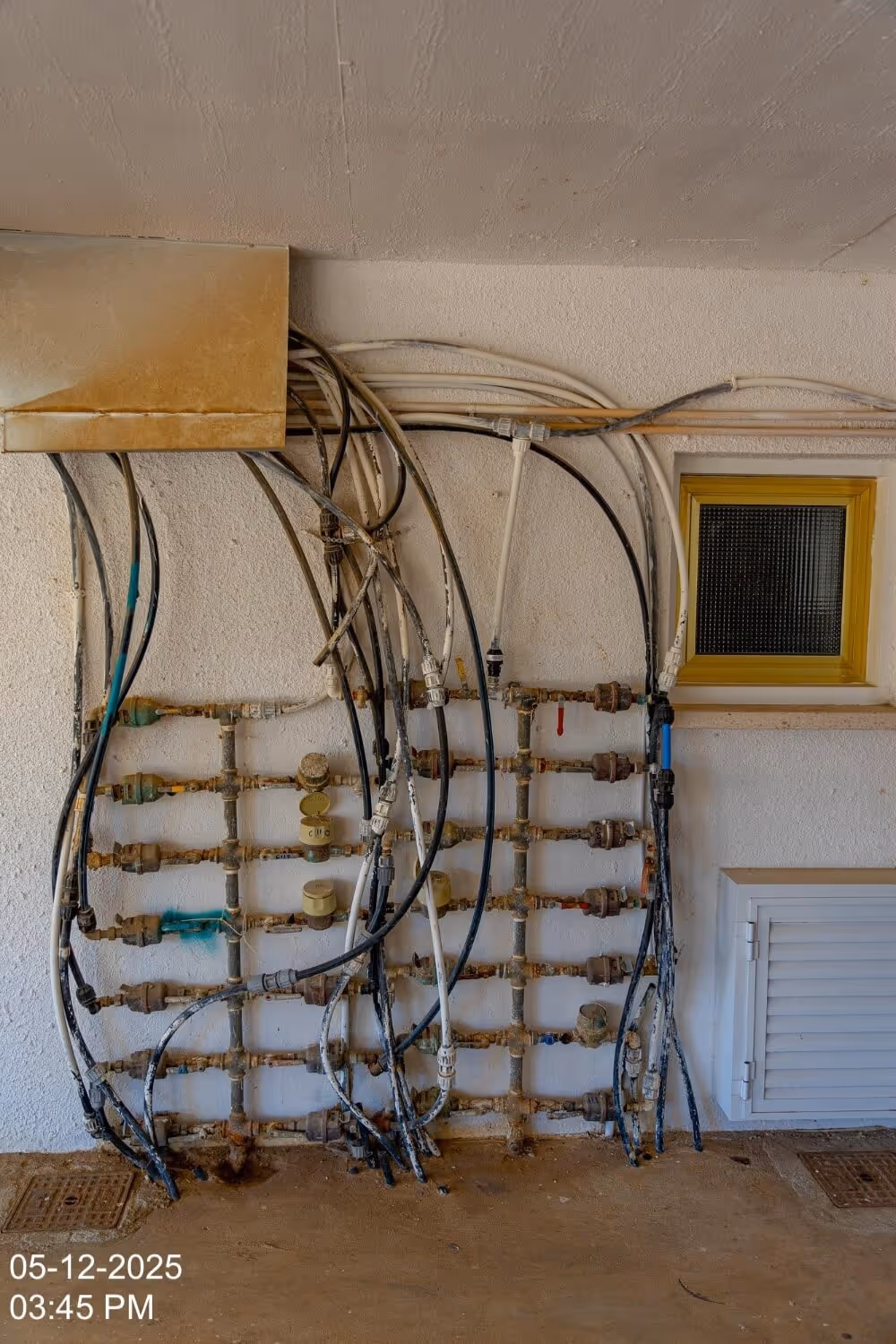
2. Display date and time in two separate lines (multi-line image text)
TEXT({visit_date}, "DD-MM-YYYY”) & CHAR(10) & TEXT({visit_time}, "hh:mm a")
What this displays:
05-12-2025
03:45 PM
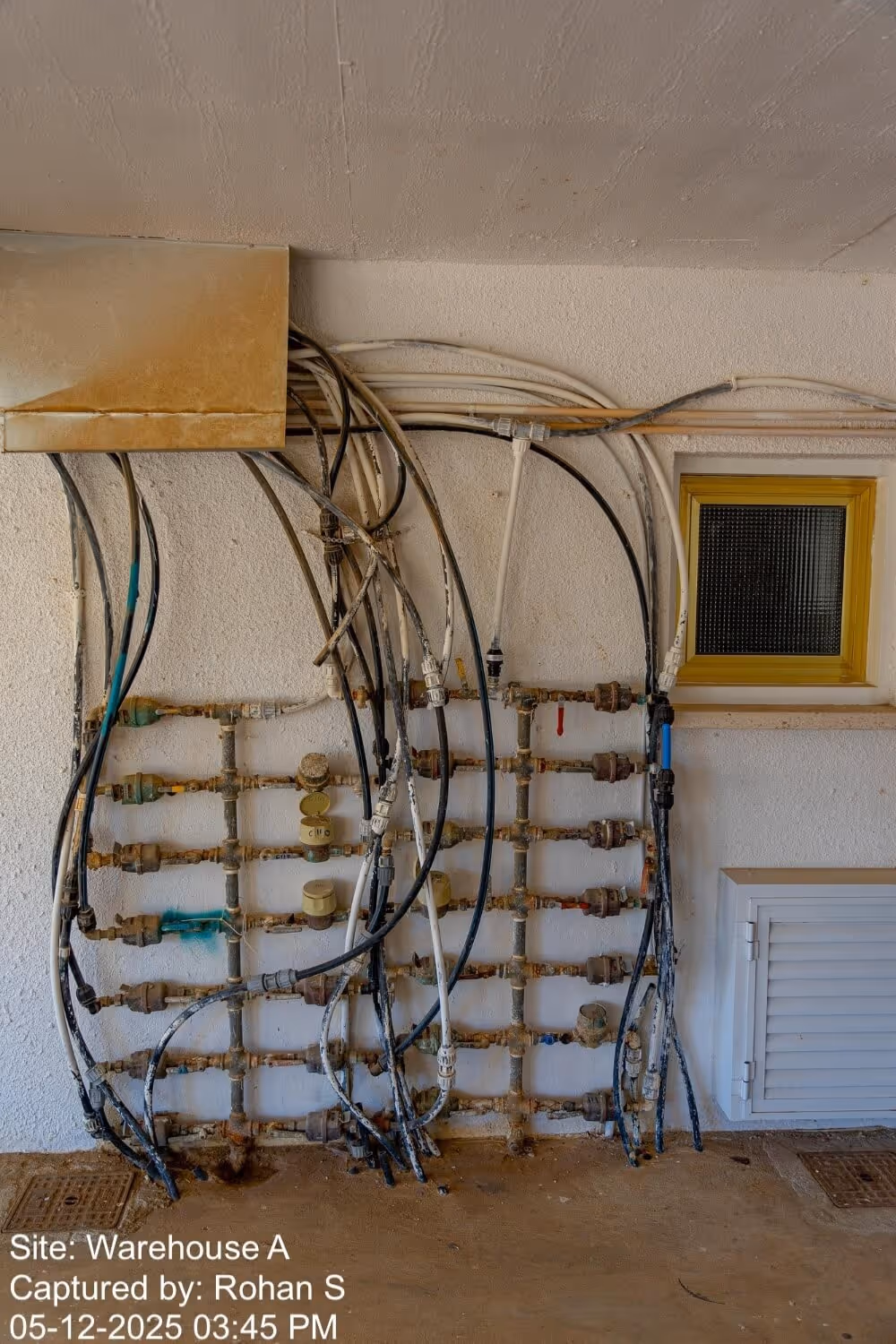
3. Multi-line business stamp (site, inspector, timestamp)
Perfect for field audits, inspections, or verification workflows.
"Site: " & {site_name} & CHAR(10) & "Captured by: " & {inspector_name} & CHAR(10) & TEXT({visit_date}, "DD-MM-YYYY") & " " & TEXT({visit_time}, "hh:mm a")
What this displays:
Site: Tower 4
Captured by: Rohan S
05-12-2025 03:45 PM
4. GPS (Address) + Notes
If “Fetch address from configured location” is enabled in your GPS Location block, the block exposes an additional variable:
{gps#address} → This gives the actual address captured by the GPS location block, not in coordinates.
The below formula allows you to show both the GPS coordinates and the address.
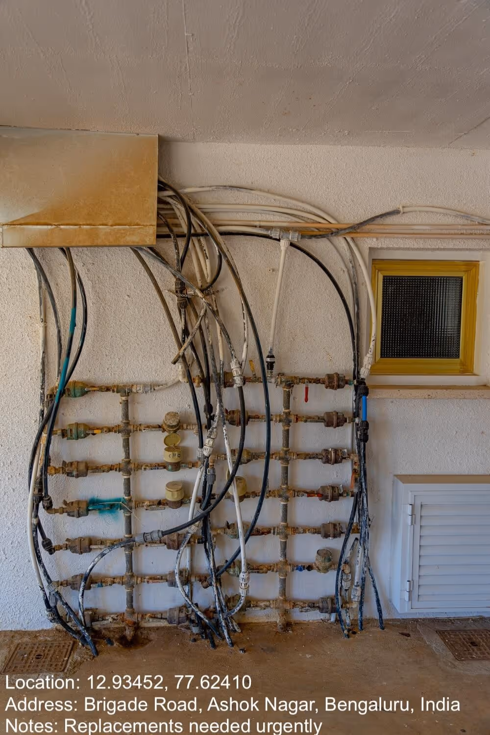
"Location: " & {gps} & CHAR(10) & "Address: " & {gps#address} & CHAR(10) & "Notes: " & {remarks}
What this displays:
Location: 12.93452, 77.62410
Address: Brigade Road, Ashok Nagar, Bengaluru, India
Notes: Broken pipe observed on the left wing.
Once an image text is added, an additional setting called Image Text Position appears.
Admins can choose which corner the text will be placed on uploaded images: Top Left, Top Right, Bottom Left, Bottom Right.

When you configure Image text in the Camera, Image & Files block, an additional option called Image text size (%) becomes available in the right panel. This option will not appear unless Image text is set.
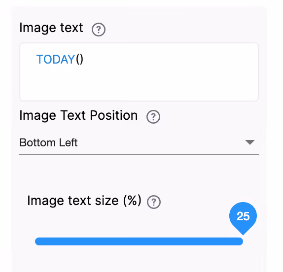
This setting controls how large the text appears on the captured image. The value is defined as a percentage of the image height.
To configure:
A lower percentage will make the text smaller, while a higher percentage will increase the text size.
For example, if the text size is set to 5%, the text will appear small on the image.

Increasing this value will make the text more prominent.

Since the size is calculated relative to the image height, the text will scale proportionally across different image sizes, ensuring consistent appearance.
This option allows admins to upload a logo that will be overlaid on images captured or uploaded through this block. The logo file can be uploaded by dragging and dropping it into the designated area.
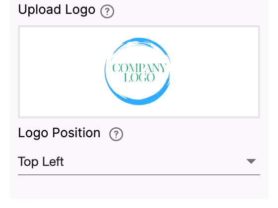
Once a logo is uploaded, an additional setting called Logo Position appears.
Admins can choose which corner the logo will be placed on uploaded images: Top Left, Top Right, Bottom Left, Bottom Right.

Let’s say for the same uploaded image as above, a logo is also uploaded to appear at the top right corner. Once the image is uploaded by the user in App Home, the logo will appear as configured.

Allow uploaded files (only via Camera, not gallery uploads) to have dynamic file names. For the images uploaded via Camera, Admins can choose a custom dynamic prefix. The prefix can take values from other fields in the App. This will help the Admins to segregate the files based on the prefix values.
Even in this field, you can type ‘@’ to get a list of all the variables in the app and select variables.

Note: Ensure that if values are to be taken from another field, that field would need to be filled in first and then take the image from the device's camera.

This will only work for Camera uploads and not for gallery uploads.
Display this field if
Use this if you want to show or hide a field under certain conditions. It accepts the standard Clappia Formulae, similar to conditional sections.
This option appears once a condition is set in the Display this field if option. Enable this setting if you want the field's value to be retained even when the field is hidden. This is useful for preserving user input in cases where the field may temporarily disappear based on conditions.

Example: If the field is hidden based on user selection but you still need to keep the entered value for future reference or calculations, enable this option to ensure the data is retained.
This option is enabled by default. End users can edit the value entered in this field after creating a submission. Disable it if you do not want the end users to edit the submitted value.

The Advanced Label option allows you to change the label of a field dynamically based on a condition you define. Instead of always showing the same fixed label under the ‘Basic’ tab, the field can display different labels depending on requirements of the form. Use spreadsheet-like functions such as IF, AND, OR, etc. and make use of other field variables to set your conditions. Type @ and select the field.
This is useful when the meaning of a field changes based on context, business logic, or user choices.
For example:
If you have a dropdown called Photo Type with options “Site Photo” and “Issue Photo”.
Label should change to match the type of image required.
So:
– If Site Photo, show “Upload Site Photo”
– If Issue Photo, show “Upload Issue Photo”
Formula:
IF({photo_type} = "Site Photo", "Upload Site Photo", "Upload Issue Photo")
This allows the same field to adapt its displayed purpose without needing multiple separate fields.
The Advanced Description option works exactly like Advanced Label, but it changes the description text instead. This is useful when guidance or instructions for a field need to change depending on earlier answers.
For example, using the same scenario from Advanced Label:
If you have a dropdown called Photo Type with options like “Site Photo” and “Issue Photo”, you may want the description of your Camera or Image Upload field to guide the user differently depending on what they selected.
So:
– If the user selects Site Photo, the description could say: “Capture a clear photo of the site for documentation.”
– If the user selects Issue Photo, the description could say: “Capture a clear photo showing the issue area and details.”
Formula:
IF({photo_type} = "Site Photo", "Capture a clear photo of the site for documentation.", "Capture a clear photo showing the issue area and details.")
This helps users understand what is required from them without showing unnecessarily long or irrelevant instructions.
Additional Examples (Apply to Both Advanced Label and Advanced Description)
1. Showing nothing until a selection is made
For example, if you have a dropdown field called Visit Category with options “Routine” and “Urgent”, you may want the label or description of a field to remain blank until the user first selects a category.
Once a selection is made:
Formula (can be used in either Advanced Label or Advanced Description):
{visit_category}The label/description stays empty until the dropdown has a selected value.
After the user picks an option, the selected text (Routine or Urgent) becomes the label or description.
2. Changing label/description based on language selection
For example, if your form includes a dropdown field called Select Language with options English, Spanish, and French, you can show the label or description in the selected language.
So:
Formula (can be used in either Advanced Label or Advanced Description):
IF({select_language} = "English", "Enter details", IF({select_language} = "Spanish", "Ingrese detalles", "Entrez les détails"))The formula returns the text for the selected language.
Only one label/description is shown at a time, depending on what the user picks in the Select Language dropdown.
1. Variables do not change
When a field is created, its variable name is derived from the label you set in the Basic tab. That variable name is what you must use in formulas, workflows, and other logic. The visible label or description shown by Advanced Label / Advanced Description does not change the variable name.
2. Submissions tab: table view vs right panel
In the Submissions area, the table view always displays the labels from the Basic tab. When you open an individual submission, the right panel shows the labels and descriptions as they appear in the form (i.e., the Advanced Label and Advanced Description applied for that submission). This keeps the submission list consistent while letting reviewers see the context-aware labels and descriptions when viewing a record.
3. Bulk Edit shows Basic tab labels and descriptions
When you need to Bulk Edit submissions, the spreadsheet you download shows the labels and descriptions from the Basic tab only. Advanced Label and Advanced Description are not applied in Bulk Edit, so keep that in mind when preparing bulk updates.
4. Some fields cannot be used inside Advanced Label/Description formulas
Certain block types do not expose a variable that can be referenced in Advanced Label or Advanced Description. If a block does not expose a variable, you cannot use it inside the formula.
Geo Address
GPS Location
PaymentGateway
Audio
Live Tracking
Signature
Code Scanner
NFC Reader
Get Data from RestApi
Get Data from Other Apps
Get Data from Google Sheets
Get Data from Database
AI Block
Text, HTML & Embedding
Attached Files
Image Viewer
Video Viewer
PFD Viewer
Code block
Progress Bar
Action Button
When a user uploads an image or video using the Camera, Images & Files block, Clappia generates a Public URL for the uploaded file. This URL allows the file to be accessed directly through a web browser.
To store and view the public URL of uploaded files within your app:
In your Clappia app (this can be any app), add either a Single Line Text or Multi-line Text block. This block will be used to store the public URL of the uploaded file.
Go to the Workflows tab of the app containing the ‘Camera, Image & Files’ block.
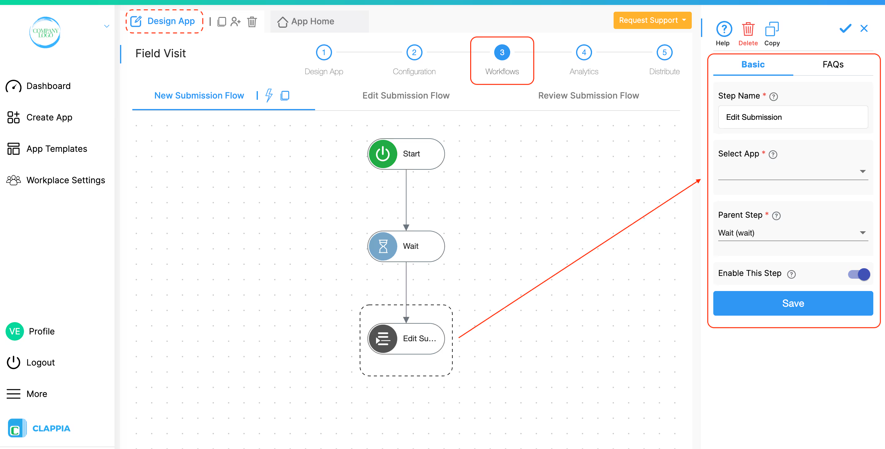
Add an Edit Submission workflow node.
In the configuration panel of the node:
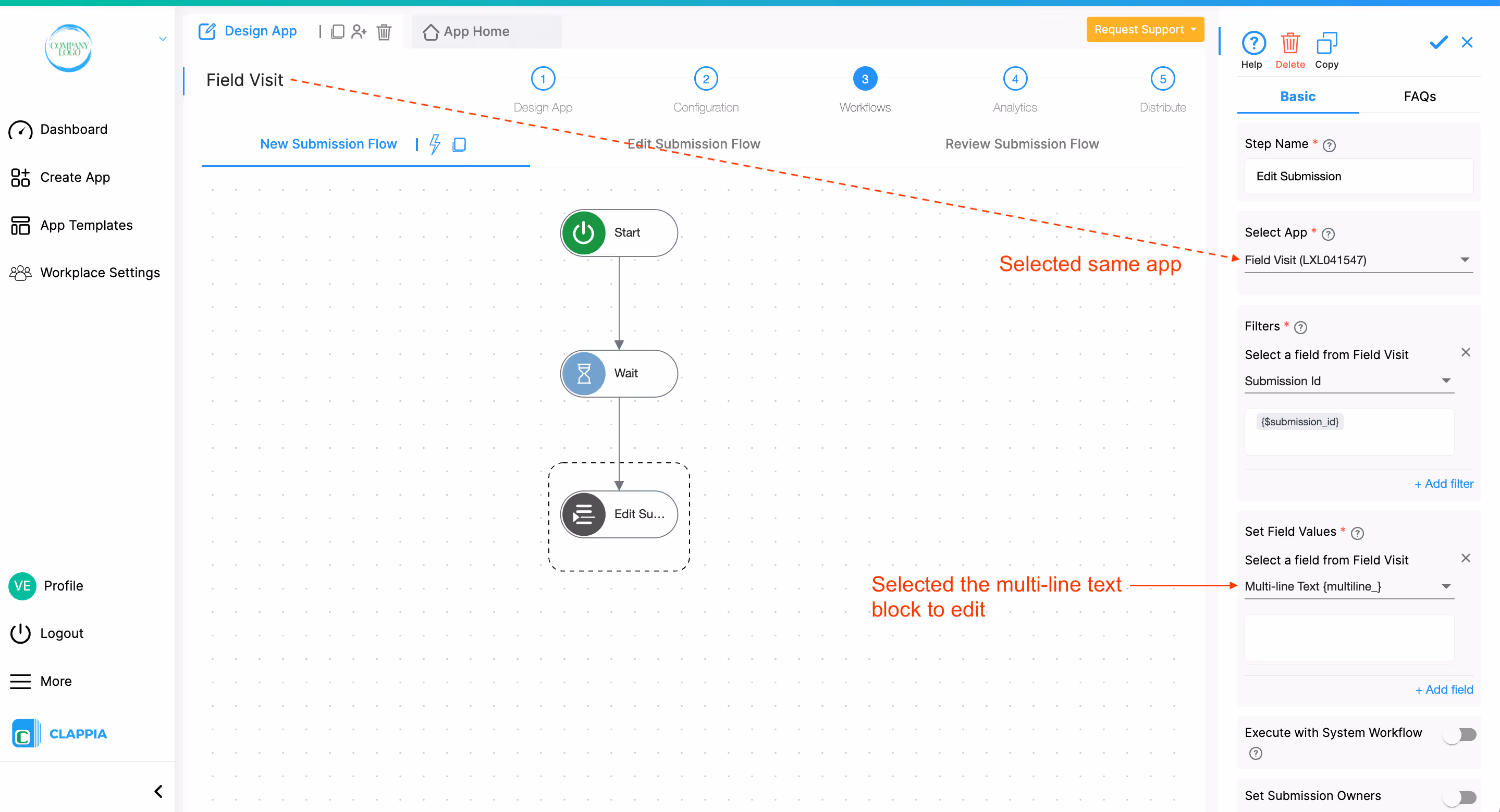
Insert the Public URL Variable
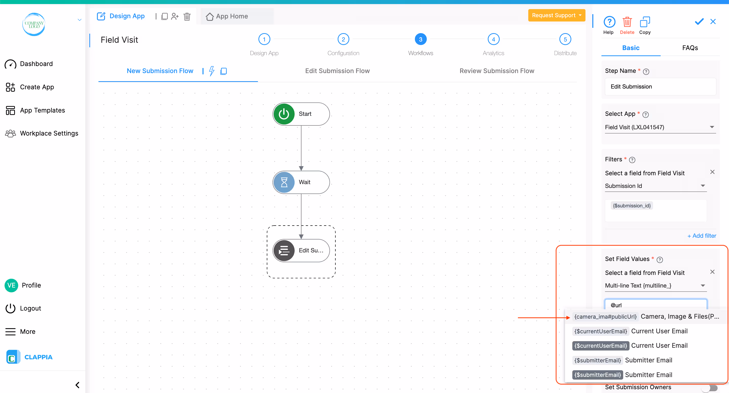
Now, every time a submission is made, the public URL of the uploaded file will be stored in the selected text block.
Keep URLs Public Forever Option
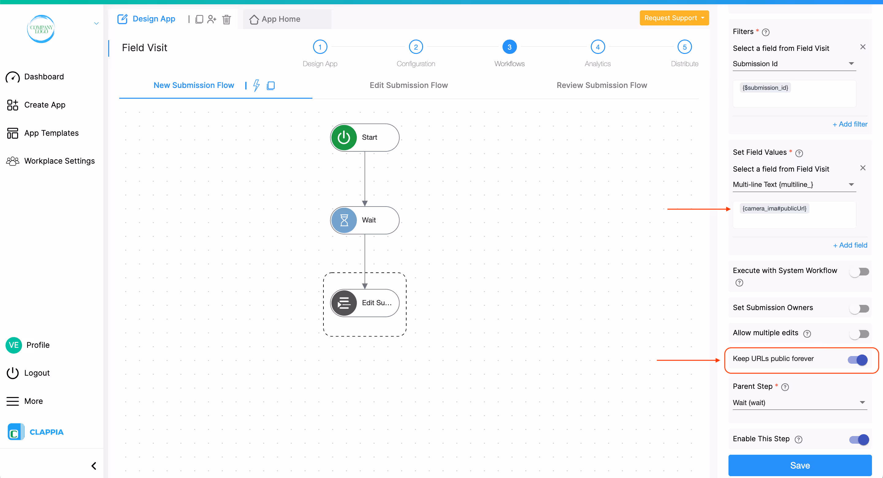
Once the public URL variable is added in the Edit Submission workflow node, an additional option appears called ‘Keep URLs Public Forever’.
Enabling this option ensures that the public URL remains accessible indefinitely.
The Clappia mobile app supports offline submissions. This means that if a user does not have an active internet connection, they can still continue filling out the form and submit it normally.
When working offline on the mobile app:
At the time of submission, if there is no internet connection, the submission is saved locally on the user’s device. It is not immediately sent to the server.
Once the device regains internet connectivity:
Important notes:
This allows users in low-connectivity areas to continue capturing evidence (photos, videos, documents) and submitting forms without interruption.
All files uploaded through the Camera, Images & Files block are securely stored on AWS (Amazon Web Services). The storage region depends on the data center selected for your workplace. If you wish to switch to a different data center region, refer to this guide.
There is no time limit on how long uploaded files are stored, as long as the associated submission is not deleted.
If a submission is archived, it can be restored within 6 months. After that, archived submissions (and their associated files) are permanently deleted and cannot be recovered.
Files uploaded through the Camera, Images & Files block can be used in workflows to:
This means that the files captured or uploaded in the original submission (images, videos, documents, etc.) will also be available in the edited or newly created submission without the user needing to upload them again.
This is useful in scenarios such as escalations, approvals, inspections, or audit workflows where supporting evidence needs to move from one submission to another.
When configuring a Create Submission or Edit Submission workflow, file fields can be mapped just like any other field by selecting the Camera block variable from the triggering submission.
The files remain accessible in the target submission just as they were in the original one.
No, the Bulk Upload feature via Excel (.xlsx) only supports data fields, not file uploads.
Images cannot be uploaded directly through the spreadsheet. However, if you include a field containing public URLs or image links, those links will appear in the submissions after upload and can be clicked to view the images.
You can capture the public URL of an image uploaded through the Camera, Images & Files block by using its public URL variable.
Add a Single Line Text field to your app, then in the Edit Submission workflow node, go to Set Field Values, choose the text field, and enter @publicurl.
Select the corresponding variable for your camera field from the list. It would look like this @camera_block_name#publicurl
Each time an image is uploaded, this text field will automatically update with the public URL of that file.
In the Advanced tab, click on Allowed file types dropdown and then select Images (Camera Uploads) only. This ensures that only camera photos can be submitted in real time.
<iframe width=\"200\" height=\"100\" src=\"https://www.youtube.com/embed/3jkwP8S30gU\" title=\"Camera, Image & Files Forms Apps Without Coding ● Clappia No-Code Low-Code Platform\" frameborder=\"0\" allow=\"accelerometer; autoplay; clipboard-write; encrypted-media; gyroscope; picture-in-picture; web-share\" allowfullscreen></iframe>
L374, 1st Floor, 5th Main Rd, Sector 6, HSR Layout, Bengaluru, Karnataka 560102, India
3500 S DuPont Hwy, Dover,
Kent 19901, Delaware, USA


.svg)


3500 S DuPont Hwy, Dover,
Kent 19901, Delaware, USA
L374, 1st Floor, 5th Main Rd, Sector 6, HSR Layout, Bengaluru, Karnataka 560102, India