
Still need help?

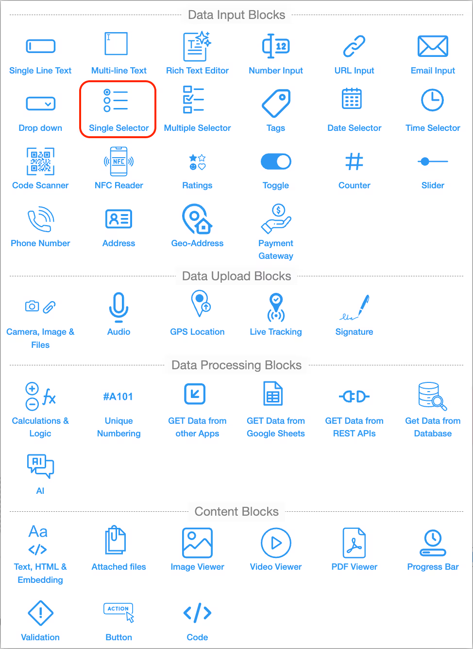
The Single Selector block allows you to present users with a set of predefined options where only one option can be selected at a time. This keeps data structured and avoids errors from free-text fields. Single Selectors are useful when you want to enforce a clear choice, such as gender, role, department, or approval status.
In addition to simple lists, single selectors can also be linked together to create dependent (nested) selectors, where one selector’s options change based on what is to be selected in another.
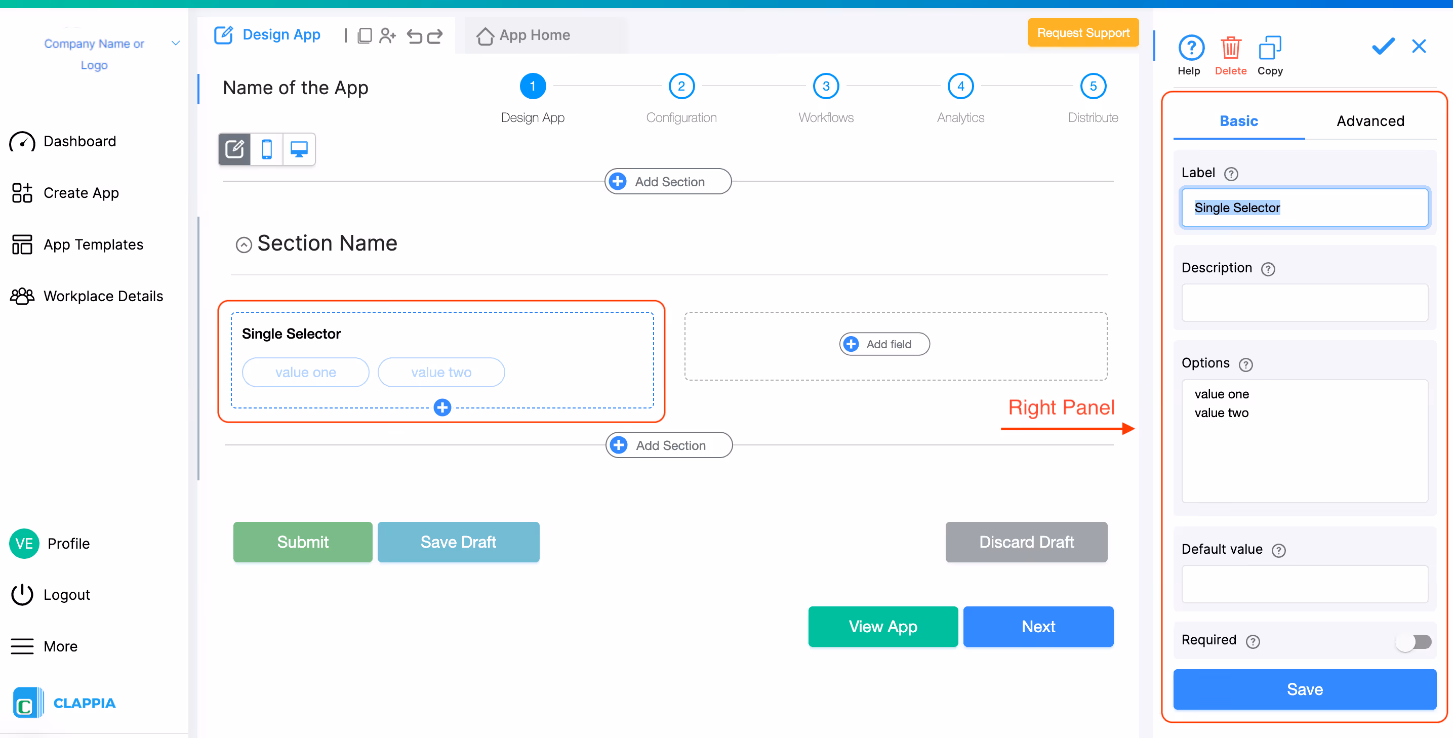
When you add a Single Selector block and click on it, the right panel opens where you can configure it.
%20(1).avif)
The name of the field shown to users.
Example: “Select Gender” or “Approval Status.”
Optional helper text displayed below the field. Use it to give instructions or leave it blank.
Example: “Select the appropriate category.”
Add all the values you want users to choose from. Each option must be on a new line.
Example:
Yes
No
Maybe
The option that should appear pre-selected when the form opens. Users can still change it before submitting.
Enable this toggle if users must make a selection before they can submit.
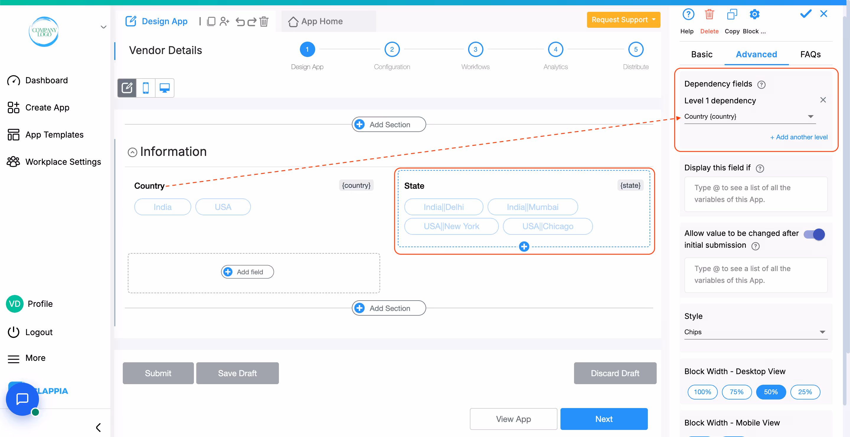
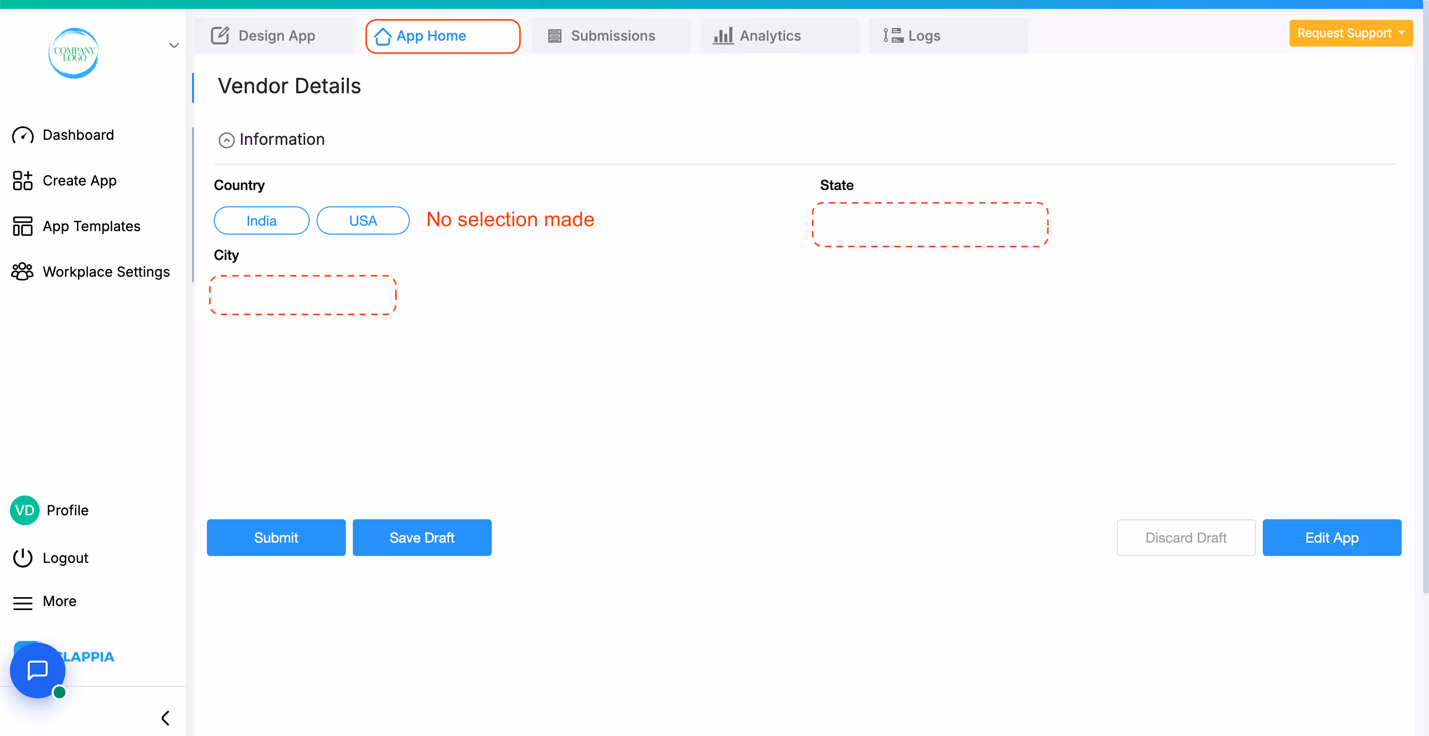
This option allows you to create nested selectors, where the available choices depend on another field.
For example:
How to configure:
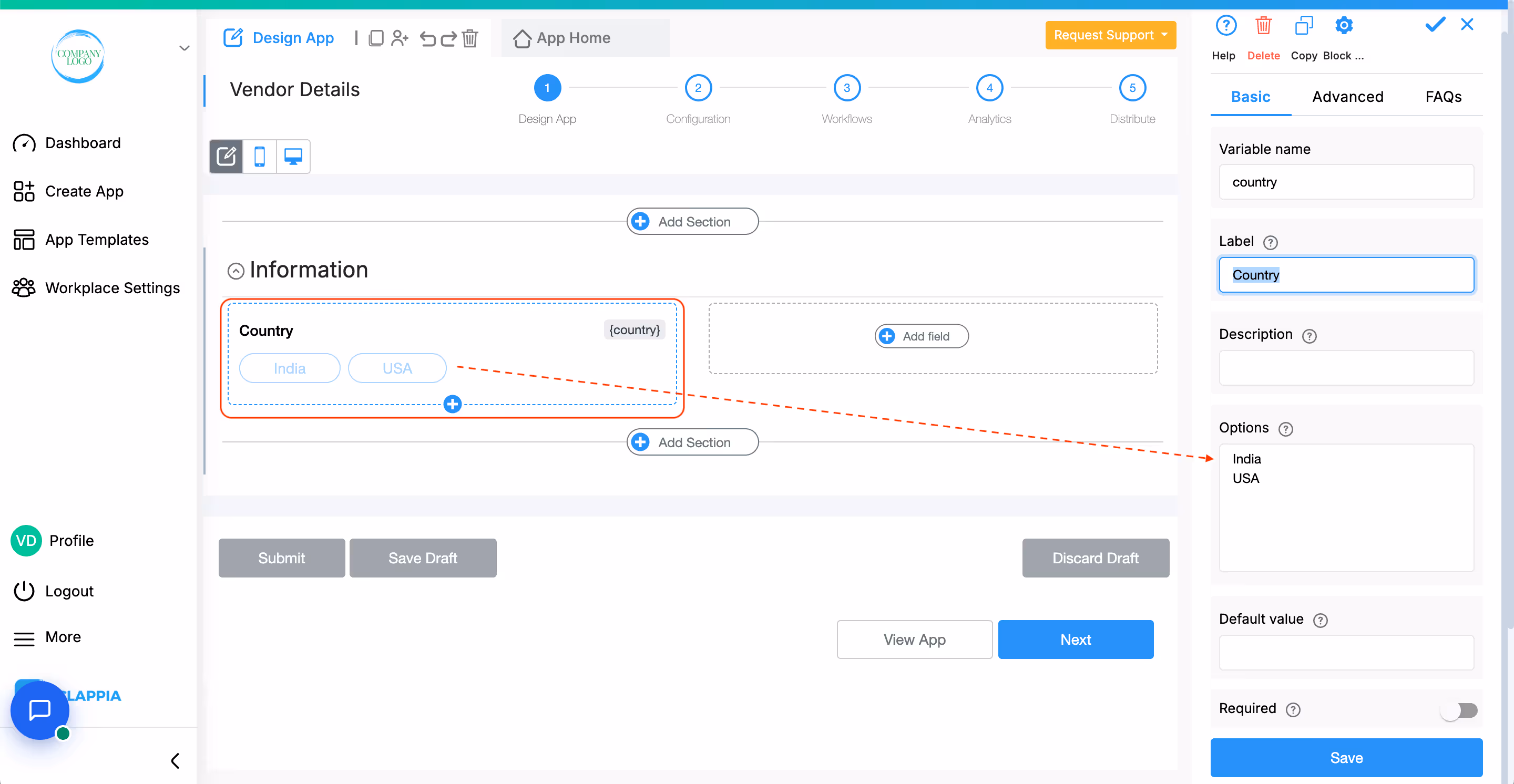
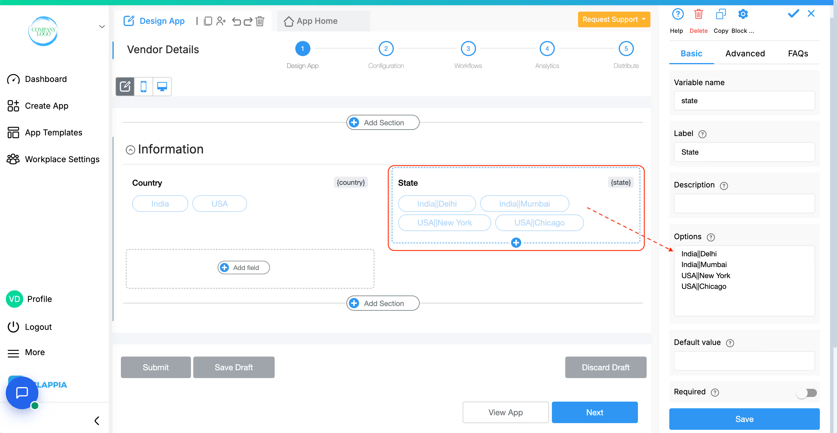
Then set the Dependency field to the Country field.
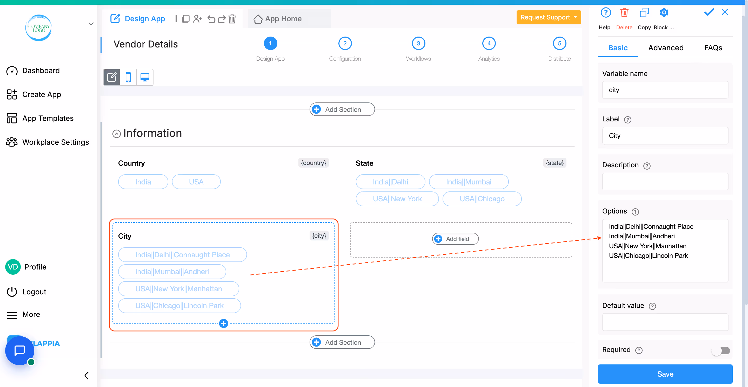
Then set the Dependency fields to both Country (level 1) and State (level 2).
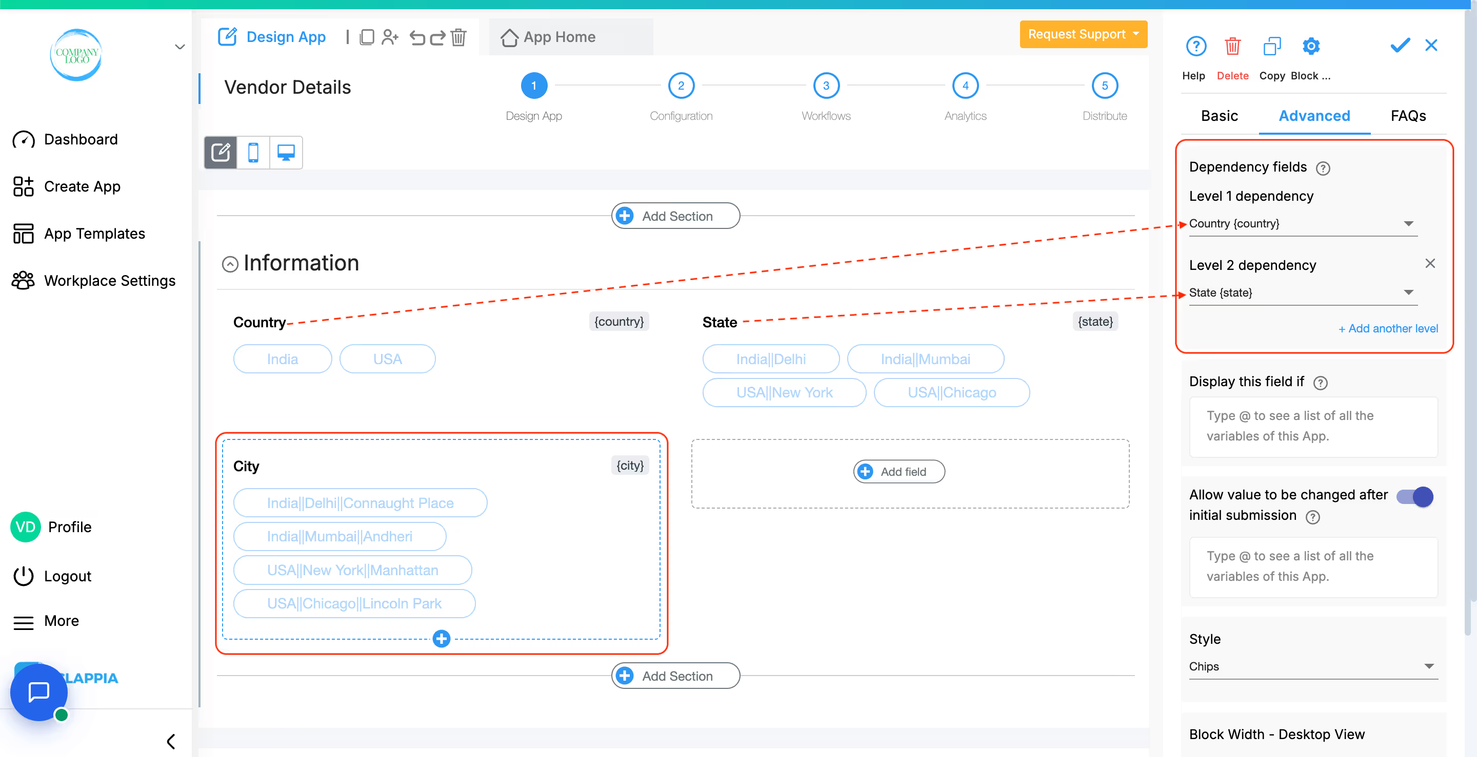
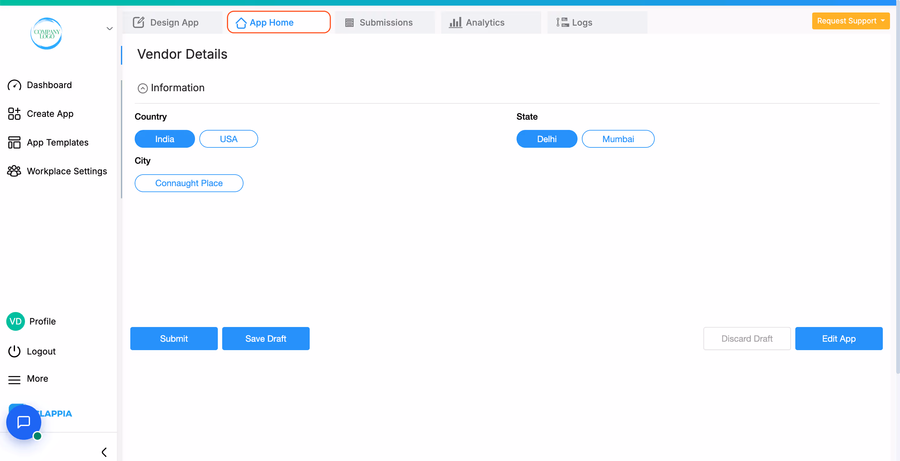
With this setup, the list in each selector dynamically updates based on the previous choice.
This is what it will look like in App Home:
Use this option to show or hide the field under specific conditions. It accepts the standard Clappia formulae, similar to conditional sections or in the ‘Calculations & Logic’ block.
This option appears once a condition is set in the Display this field if option. Enable this setting if you want the field's value to be retained even when the field is hidden. This is useful for preserving user input in cases where the field may temporarily disappear based on conditions.
Example: If the field is hidden based on user selection but you still need to keep the entered value for future reference or calculations, enable this option to ensure the data is retained.
This option is enabled by default.
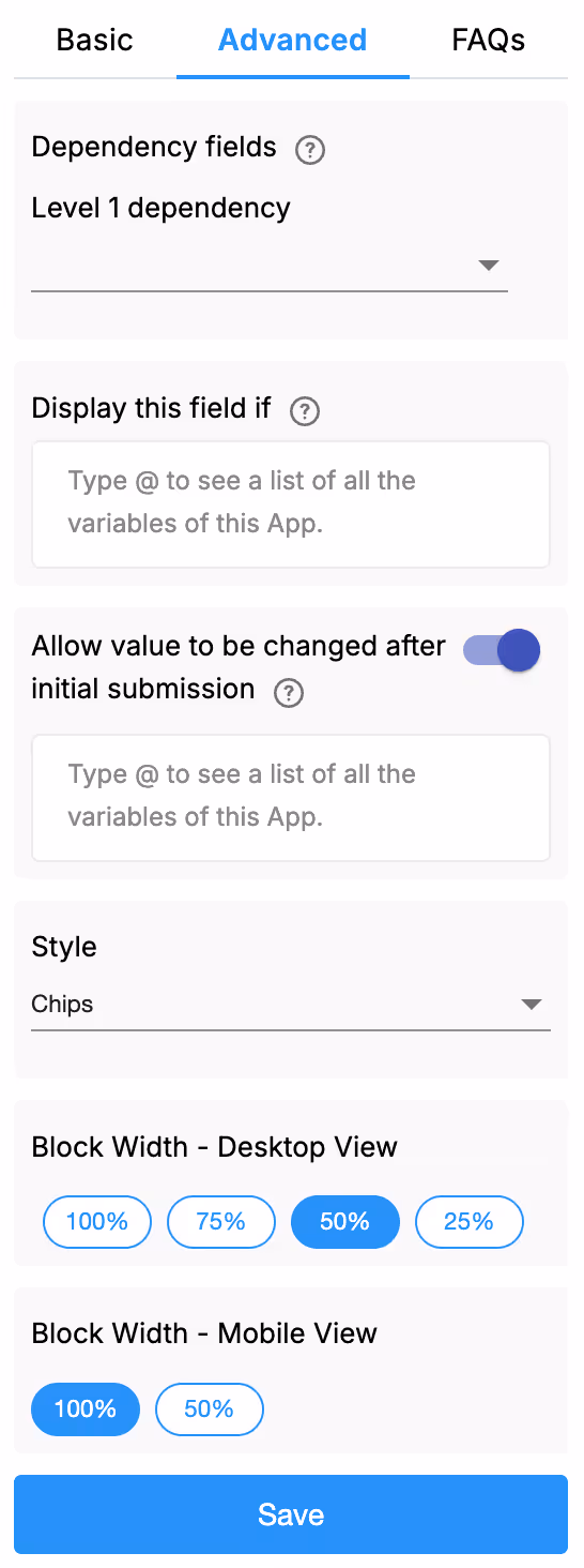
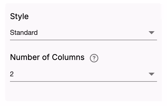
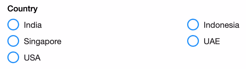
Change the appearances of the options as Chips or Standard.
Chips View:


Standard View:
Adjust how wide the selector appears on screen:
After saving your configuration, the system automatically assigns a Variable Name to the dropdown field. This variable name is used when:
You can change the variable name to something short and meaningful.

The Advanced Label option allows you to change the label of a field dynamically based on a condition you define. Instead of always showing the same fixed label under the ‘Basic’ tab, the field can display different labels depending on requirements of the form. Use spreadsheet-like functions such as IF, AND, OR, etc. and make use of other field variables to set your conditions. Type @ and select the field.
This is useful when the meaning of a field changes based on context, business logic, or user choices.
For example:
If you have a dropdown field named Priority Group with options “Operational” and “Admin”.
Your selector field should have a label that matches the group.
So:
– If Operational, show “Operational Priority”
– If Admin, show “Admin Priority”
Formula:
IF({priority_group} = "Operational", "Operational Priority", "Admin Priority")
This allows the same field to adapt its displayed purpose without needing multiple separate fields.
The Advanced Description option works exactly like Advanced Label, but it changes the description text instead. This is useful when guidance or instructions for a field need to change depending on earlier answers.
For example, using the same scenario from Advanced Label:
If you have a dropdown called Priority Group with options like “Operational” and “Admin”, you may want the description of your Single Selector field to guide the user differently depending on what they selected.
So:
– If the user selects Operational, the description could say: “Choose the operational priority that applies to this task.”
– If the user selects Admin, the description could say: “Choose the administrative priority relevant for internal tracking.”
Formula:
IF({priority_group} = "Operational",
    "Choose the operational priority that applies to this task.",
    "Choose the administrative priority relevant for internal tracking.")
This helps users understand what is required from them without showing unnecessarily long or irrelevant instructions.
Additional Examples (Apply to Both Advanced Label and Advanced Description)
1. Showing nothing until a selection is made
For example, if you have a dropdown field called Visit Category with options “Routine” and “Urgent”, you may want the label or description of a field to remain blank until the user first selects a category.
Once a selection is made:
Formula (can be used in either Advanced Label or Advanced Description):
{visit_category}The label/description stays empty until the dropdown has a selected value.
After the user picks an option, the selected text (Routine or Urgent) becomes the label or description.
2. Changing label/description based on language selection
For example, if your form includes a dropdown field called Select Language with options English, Spanish, and French, you can show the label or description in the selected language.
So:
Formula (can be used in either Advanced Label or Advanced Description):
IF({select_language} = "English", "Enter details", IF({select_language} = "Spanish", "Ingrese detalles", "Entrez les détails"))The formula returns the text for the selected language.
Only one label/description is shown at a time, depending on what the user picks in the Select Language dropdown.
1. Variables do not change
When a field is created, its variable name is derived from the label you set in the Basic tab. That variable name is what you must use in formulas, workflows, and other logic. The visible label or description shown by Advanced Label / Advanced Description does not change the variable name.
2. Submissions tab: table view vs right panel
In the Submissions area, the table view always displays the labels from the Basic tab. When you open an individual submission, the right panel shows the labels and descriptions as they appear in the form (i.e., the Advanced Label and Advanced Description applied for that submission). This keeps the submission list consistent while letting reviewers see the context-aware labels and descriptions when viewing a record.
3. Bulk Edit shows Basic tab labels and descriptions
When you need to Bulk Edit submissions, the spreadsheet you download shows the labels and descriptions from the Basic tab only. Advanced Label and Advanced Description are not applied in Bulk Edit, so keep that in mind when preparing bulk updates.
4. Some fields cannot be used inside Advanced Label/Description formulas
Certain block types do not expose a variable that can be referenced in Advanced Label or Advanced Description. If a block does not expose a variable, you cannot use it inside the formula.
Geo Address
GPS Location
PaymentGateway
Audio
Live Tracking
Signature
Code Scanner
Nfc Reader
Get Data from RestApi
Get Data from Other Apps
Get Data from Google Sheets
Get Data from Database
AI Block
Text, HTML & Embedding
Attached Files
Image Viewer
Video Viewer
PFD Viewer
Code block
Progress Bar
Action Button
L374, 1st Floor, 5th Main Rd, Sector 6, HSR Layout, Bengaluru, Karnataka 560102, India
3500 S DuPont Hwy, Dover,
Kent 19901, Delaware, USA


.svg)


3500 S DuPont Hwy, Dover,
Kent 19901, Delaware, USA
L374, 1st Floor, 5th Main Rd, Sector 6, HSR Layout, Bengaluru, Karnataka 560102, India